GymProLuxe Facebook Ad Teardown
The brand creative would score a 7. The affiliate's bullets dragged it to 5.6. And then there is the 100,000-user claim sitting next to 5 likes....
AD TEARDOWNS

GymProLuxe Facebook Ad Teardown
GymProLuxe is in everyone's feed right now and one of their affiliate Pages is running an ad that's doing two jobs at once. The brand's own creative is genuinely sharp. The affiliate's post copy slapped on top is generic bullet salad. Together they produce an ad that's leaking conversions for no good reason, and the most interesting detail in the entire piece sits in the platform footer where a "100,000 users" claim lands two inches above 5 visible likes.

The setup
This is running on a Page called "Best Fitness Gadgets for 2025", which means an affiliate operator is pushing GymProLuxe through their own pipeline rather than the brand running it directly. That detail matters because the ad has two distinct voices stacked on top of each other.
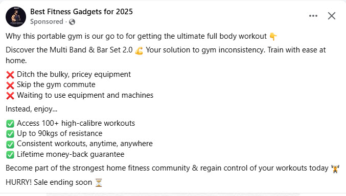
The post copy at the top is the affiliate's contribution. It opens with "Why this portable gym is our go to for getting the ultimate full body workout" and runs through the standard bullet stack of features dressed as benefits. Ditch the bulky equipment. Skip the gym commute. 100+ workouts. 90kgs of resistance. Lifetime money-back. Two hundred sellers ran this exact format last quarter, which is your first signal that nobody put much thought into it.
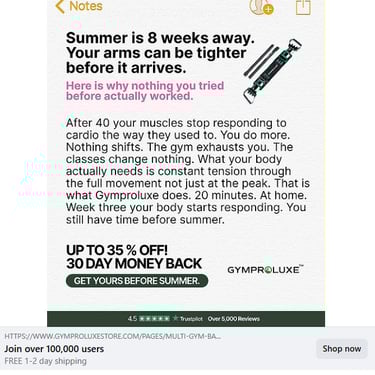
The creative below it is the brand's contribution and reads like a different writer entirely. Notes-app aesthetic, pink subheading, and a specific opening line: "Summer is 8 weeks away. Your arms can be tighter before it arrives." Then the body copy: "After 40 your muscles stop responding to cardio the way they used to. You do more. Nothing shifts. The gym exhausts you. The classes change nothing."
Two ads stacked on top of each other targeting two different prospects with two different angles. The post copy is selling to anyone who's ever found a gym inconvenient. The creative is selling to over-40s whose body has stopped responding to what used to work. A scrolling buyer doesn't reconcile that. They pick one signal and move on, and they're picking based on which layer their eye lands on first.
The structural scoring
Running this through the standard five-gate diagnostic, weighted for cold DTC at low-to-mid ticket:
The verdict is HOLD, just barely above KILL territory. The interesting bit sits underneath the score though, because the creative on its own would score around a 7 and the post copy on its own would score around a 4. Combined they cancel each other out and the affiliate ends up paying Meta for traffic that hits a structurally compromised ad before the buyer even reaches the landing page.
What the brand got right
The Notes-app aesthetic is genuinely fresh on Meta. It mimics organic content. The scroll-past instinct doesn't fire as hard because the format reads as a personal note rather than an ad. The opening line plants a deadline (8 weeks) and a specific outcome (tighter arms) in a single beat, which is more discipline than most fitness ads manage in their entire body copy. The pink subheading "Here is why nothing you tried before actually worked" is contrarian and curiosity-loaded, doing real lift in the cold scroll.
The body copy is the strongest single element of the entire ad. "After 40 your muscles stop responding to cardio the way they used to. You do more. Nothing shifts. The gym exhausts you. The classes change nothing." Whoever wrote that knows the over-40 fitness frustration well enough that the reader feels caught. Named pain, specific, the kind of uncomfortable recognition that makes a reader stop scrolling and read another paragraph, which is the exact behaviour Meta charges you for.
Then it introduces a mechanism: "What your body actually needs is constant tension through the full movement not just at the peak." That single line is the most rankable, repeatable, memorable thing in the entire ad. It gives the reader something to believe in beyond "buy this product", and it's the kind of explanation a buyer might actually quote to someone else over coffee.
A specific timeframe lands the close: "Week three your body starts responding." The brand could have said "instant results" or "transform in 7 days". They chose "week three" instead, and that small choice signals a writer who respects the reader's intelligence.
Three of the four moves Wiebe-style copy lives on. Pattern interrupt, named pain, specific mechanism. The one missing piece is genuine proof scaled to the claim, and that's where the ad falls apart.
What the affiliate got wrong
The post copy contradicts the creative on audience and angle. It's targeting a different prospect with a different message. A buyer who gets hooked by "your muscles stop responding to cardio" then glances up at the post copy gets yanked into a generic anti-gym pitch, and by the time they've read the bullets the emotional momentum from the creative has drained out of the room. That matters because the whole point of the creative's specificity is to make a particular reader feel seen, and the post copy above it is busy trying to talk to everyone in the world at once.
Standalone the post copy would score a 4. Generic opener. Bullet stack. No mechanism. No audience hook. "Strongest home fitness community" is an unsupported superlative that buyers stopped believing about a decade ago. "100+ high-calibre workouts" is a specific number with no demonstration of what makes them high-calibre, leaving the reader to fill in the gap with whatever scepticism they brought to the page. "HURRY! Sale ending soon" is the weakest line in the entire piece and it's the last thing a reader sees before deciding to scroll, which is the worst possible position for the worst possible line.
The Page name itself does damage. "Best Fitness Gadgets for 2025" reads as affiliate bin from the first glance. Buyers who've spent any real time on Meta recognise the format and discount everything underneath it as paid promotion before they've read a single word. That framing makes the brand creative work twice as hard to overcome the suspicion the Page name has already planted.
The proof problem
Now to the most quotable detail in the whole teardown. The platform footer claims "Join over 100,000 users". The post itself shows 5 likes.
The two numbers measure different things. Users means customers who bought. Likes means anyone who tapped the thumbs up while scrolling, which is a much lower bar. A sceptical buyer who thinks it through gets to the right conclusion eventually. The problem is most buyers don't think it through. They catch both numbers in the same glance, the gut fires before the analytical brain catches up, and something feels off before they can articulate why.
There's a second issue underneath the first. If a brand claiming 100,000 users can't pull more than 5 reactions on a sponsored post running to a fitness audience, the engagement signal is anaemic regardless of what the math technically means. Either the creative isn't landing with enough viewers to generate any momentum, or nobody on the affiliate's side bothered to seed early reactions to make the post look alive. Most likely it's a mix of both. Either way the buyer registers what the gut already told them, which is that this post isn't the runaway hit the user count claims it should be.
The Trustpilot 4.5 rating with 5,000+ reviews is real proof. Verifiable, specific, and it works. Slightly off-key choice because Trustpilot reviews companies rather than products, but most buyers won't notice and the proof is genuine. Lean on that. The unverifiable 100,000 claim should disappear entirely because it does more damage than good when the reader can see the engagement numbers sitting right next to it.
Three urgency levers stacked at the close (35% off, summer deadline, "sale ending soon") starts to read as pressure rather than direction. Two would do the job better. The summer deadline gives the urgency a reason to exist and the discount makes it tangible. The third lever turns the close from confident into desperate, which undoes the careful, restrained tone the brand's body copy worked hard to build.
What needs to change
The single highest-impact fix is the post copy. Either remove it entirely and let the creative speak, or rewrite it in one line that mirrors the creative's angle. Something like "Over-40s training at home, this is why constant tension works when cardio doesn't" would lift the whole unit by 0.5 to 0.8 points without touching the creative at all. That's two minutes of work for significant lift, which makes it the cheapest structural fix in the entire pipeline.
The "100,000 users" claim still needs to go. Even if the math is technically defensible, the visual juxtaposition with 5 reactions creates the wrong gut response in a buyer who isn't running the numbers. Replace it with the Trustpilot proof, which is real and verifiable and does the job the bigger claim was meant to do.
The "After 40, your muscles stop responding to cardio" insight should be the headline of the post copy, not buried inside the creative image where Meta's algorithm can't index it as text. Pulling that line forward makes the ad more findable through search and gives the reader's eye a clear hook the moment the post loads.
Drop one urgency lever. Keep the summer deadline and the 35% discount. Lose "HURRY! Sale ending soon" because it's the line doing the least work and the most damage.
If GymProLuxe runs this same creative through their own brand Page in parallel, that version will outperform the affiliate version on the same buyer. The Page name alone is worth testing because it removes the affiliate framing tax the current setup is paying every time a sceptical buyer scrolls past.
The takeaway
Two layers of ad copy must run on the same temperature dial. Cold creative needs cold post copy. Problem-aware creative needs problem-aware post copy. Mechanism-led creative needs mechanism-led post copy. The biggest mistake affiliates make on Meta is treating the post copy as filler text above the "real" ad. The post copy is part of the ad. Buyers read both, and when the two layers fight each other the buyer scrolls.
The brand creative here is decent. Better than most of what runs on Meta in this category. The affiliate is leaking conversions for the price of two minutes of post copy effort, which means the structural problem is fixable for free and the upside is immediate.
A 5.6 score is a 7+ creative wearing a 4 coat. Take the coat off and the ad does the work it was built to do.